Throughout history there have been many years and even decades when gold outperformed equities. The question I am going to ask is "is this time different?" I am particularly interested at looking at the 1970's when the U.S. had high inflation and low economic growth. The FED is tightening yet many economic indicators are slow to point to a full-blown recession. Inflation has been hard to tame for Jerome Powell thus far. Stagflation is a probable outcome in this economic scenario. There is also the increasing potential for geopolitical events as it relates to oil as there is tension between eastern and western nations.
So far, many parts of the economy have been unprecedently resilient to higher rates. Housing has been one of them as many people are buying from fear of missing out and moving to cheaper cities. The second period in history that saw gold outperfrom equities was 2000 to 2012. This was following a long secular expansion and tech bubble collapse. We now are at the end of a long expansion and crypto and Bitcoin bubble burst.
Gold also did well following the 2008 banking panic but I am particularly interested in the years when gold rose as stocks fell. These are the years in the 1970s and 2001 to 2003. So, I see a couple likely scenarios economically. The FED tightening causes a recession that is mild or severe. If it is mild I see a possibility of inflation sticking around like the 70s. If it is severe and there are major bank panics it will likely be resolved quickly as 1907 was with J.P. Morgan helping bail out Trust Company of America and the 2008 panic were. In 2008 much of the deflation came in less than one year as housing collapsed and banking products failed. The Government in 2008 was fairly quick to inject capital and launch QE in 2009. Gold benefited from that.
In 2009 I predicted the pivot point on gold and was bullish right before its historic run. I said, "This chart sends a powerful signal. It is saying that it is more than likely that gold the commodity will continue higher. Let me rephrase that. Very likely." I had noticed a triangle formation on the gold chart.
What Can We Learn From The Past?
Let's switch gears and go back to the 1970's. It was a period of much uncertainty politically and economically. The highlighted regions show two periods where stocks fell and gold rose. Even the entire decade had stocks losing to gold. Gold traded for $35 in 1971 and went to over $850 returning 2,300% in ten years.
Next let us view the 2001 recession and gold and stocks. We see yet again periods when gold rose as equity indices fell in 2001 to 2003. This was during the recession of 2001 when unemployment rose from 4% to 5.5%. Then Fed Chair Alan Greenspan kept interest rates historically low during his tenure.
Here is a longer-term chart of equities and gold.
The gold market is now signaling extreme strength as the daily chart is showing a very powerful consolidation pattern. It is a bullish triangle formation as you can see below. Gold miners are alreading breaking higher from this consolidation like Franco-Nevada (FNV). I am currently long the gold ETF GDX calls. Other liquid ETFs include VanEck Junior Gold Miners ETF GDXJ and SPDR Gold Trust GLD. GLD doesn't hold physcial reserves though. Sprott Physical Gold Trust PHYS is a gold etf that holds actual gold.
Final Thoughts
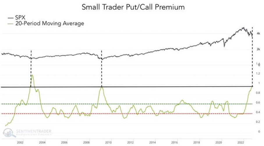
Everyone is scrambling to find cheap gold mining stocks. As gold is consolidating at levels near last years highs I see a good possiblity of different scenarios. Over many recent years gold has been a "risk on" trade. Meaning it usually will only rise when stocks and other assets do. There were a couple days during the most recent banking troubles, however, where gold and Bitcoin had positive days while equities fell. Currently, gold is surpassing Bitcoin in this potential "flight to safety."
I see it rising as it did in 2001 and 2009 if the FED ends up reacting to a recession with QE like 2009 or with another extreme loosening like in 2001. The odds are stacked that we are going to get a recession with historic FED tightening and yield curve inversion. The other scenario is a recession with elements of inflation sticking like the 1970 and even a weak U.S. Dollar.
Whether one sees it as a stagflationary safehaven or an inflation hedge on a declining stock market. I see gold as a historically wise investment vehicle at this time and for many years to come as we sort out this economic cycle. It may start making new highs very soon or it may take months before the momentum starts but I see gold moving higher over the next year. Increasing allocation to gold just makes sense.
Subscribe to my Substack for deep value stock ideas.
Full disclosure: I am long GDX call options currently and may take positions in stocks mentioned. I have no physcial gold holidings. I have approx. two dozen silver coins.
charts courtesy bullionvault.co.uk and stockcharts.com
Showing posts with label Technical Analysis. Show all posts
Stock Market Top Bull Trap Set
You may remember my blog post from late October where I outlined the scenario of a stock market bottom. I gave the exact levels it would need to break through to confirm and had a good read on the price action down there. The very bottom came on CPI day in October. It was also a bear trap. A bear trap is where the price action begins to go lower enticing sellers and short sellers to sell. What happens though is the momentum quickly shifts back to bullish as price fails to continue to go lower. We saw an epic bear trap on that October day. It was one of the largest reversals from a 52 week low in history.
You may or may not have noticed that on CPI day this week the market shot up early but fell after the CPI news. It was another trap!! And on CPI day again! Maybe it's a big coincidence or the CPI and inflation expectations are the main driver of equities during this time. Inflation is one of the biggest economic factors affecting consumers and businesses these days and not to mention the FED's decisions. We can see the two CPI days in this chart and how it is breaking the uptrend line. It tried to reclaim trend support on the CPI day which was yesterday and that is when we got the big failed signal. Failed signals are powerfull. It will take something special to continue higher from here. I'm not yet fully committed to this being the top but if we see a break of the yellow line around 389.50 on SPY it's game on for more lows.
We've got some obvious rounding top formation going on in small-caps.
Stock Market Bear Rally In the Works?
I have been looking at the major stock market indices closely lately for signs of a real rally. The Russell 2000 index of small-cap companies ticker IWM has shown rising support levels in an uptrend. There isn't confirmation of a new trend up yet but the setup is there. So many stocks are oversold near-term I see a bounce in the market as a likely scenario. If we don't bounce here there will just be a much bigger short-term rally in weeks to come. Here is the support area on the bottom yellow line for IWM. It's a pretty solid level that keeps getting support. There is also a downtrend breakout seen over the top diagonal yellow line. We are testing this level currently. It's roughly the same with SPY QQQ's.
You would think tech would need to be strong to see a market rally and it is making progress here. I put a bollinger band up on here and you can see when it breaks through either top or bottom the momentum continues awhile. I'd like to see it break over the red line also. That's been a key level. Let's see what it does next week.
The small-cap put to call ratio is showing historic signs of a bottom forming.
I noticed the energy sector is making multi-month highs. XLE has been very strong. My understanding is that crude oil is in a sweet spot for their margins. Still I wouldn't expect such a big move and if the market is going to rally a bit something has to lead right?
Bitcoin Double Top Forming
Here is some brief technical analysis on Bitcoin and the ETF GBTC. It couldn't reach a new high last winter and looks to be a clear double top formation starting. I drew another red line where there is some support. If this support gets taken out and price keeps dropping that is confirmatin of a top and we won't see new highs for some time. The chart is telling us there is likely more downside to come. If one is asking "is it a good time to buy Bitcoin?" the chart is telling us to wait.
TLT Short Setup
Long-term T-bonds look like a top was in. It did a technical top formation and took out support. They have just rebounded and kissed right off the old support line that is now resistance. Very text book action going on here. The fundamentals are when rates go up bonds go down and it looks like that is going to play out if the FED is forced into a corner with rates because of inflation. I think shorting bonds is a good play here. I am looking at the TBT ETF.
Net Tangible Asset Play AQMS
I found AQMS Aqua Metals in a scan. I calculated rough net tangible asset value at $51.8 mil. The current market cap is $46. Looks like a property fire beat it down quickly but it was down regardless. Balance sheet looks ok. Current ratio is above 1. Seeing revenue guidance from Zacks and Yahoo at $39 mil to $42 mil next year. Up from about $5 mil this year. Earnings misses are narrowing. Seeing 1 or 2 analysts. It is not profitable but it's trying to bottom out here. A clear bull flag off unusual high volume the other day.
Gold Play Setting Up
I've been posting on Twitter about the technical setup forming on gold. I'm long some GLD I picked up a couple weeks ago or so. I'm going to buy more gold via an ETF or maybe even a leveraged ETF or mining ETF if gold starts to breakout again. I suspect if the FED cuts rates at all gold is going to rocket and not look back. I'm watching the futures themselves to see what happens of this triangular bull flag. The physical trust ETFs and some gold mining stocks are really running already. JNUG is a big breakout. Lots of breakouts like on CEF, AG, PSLV etc.
PSG Ripe for a Short
This company Performance Sports Group ticker PSG has run up 100% in less than 30 days from $1 and change to $4.00 a share. It appears the main driver of this huge run is that it is in such a poor financial position it got an extension on a loan agreement. This is from another article,
Shares of Performance Sports Group (PSG) were surging 29.44% to $2.33 on heavy trading volume late Friday morning as the sports equipment maker nears a deal to receive a 60-day extension to meet its loan covenants, sources told the New York Post. If the Exeter, NH-based company fails to reach such a deal, it will reportedly default on August 29 and consequently become vulnerable to creditor action. Certain creditors hope to swap their debt for equity and assume control of the business, the Post reports.
A quick peek reveals it doesn't seem to be going well financially for the company. I ask myself is a move from $1.80 to $4 logical given what I see here. I think this run-up is overdone. Technically, it has printed a couple doji candles back to back and the last two trading days have been red. It looks ready to roll over if $3.88 fails to hold. I have a stop order to short sell PSG at $3.87.
Short Setup On NTP
Recently, I came across a familiar chart pattern in the stock NTP. It shows a long period of normal, light daily trading volume. We can see roughly two weeks ago the stock surged much higher on unusual volume. The unusual volume continued everyday as the stock continued to run. The daily candle's representing each trading day became shorter the past few days. These are doji candles. Doji candles indicate uncertainty and often are the beginning of a trend reversal. In the case of NTP this reversal could be down. This kind of enormous unusual buy volume always gets exhausted. It can't keep up for weeks. This stock looks overbought. I see it going lower in the short-term.
Initially, I only noticed the chart but digging deeper into the company I discovered this is a Chinese company. There was some news before the move up about a share buyback. I couldn't find any other substantive news on the stock around the beginning of the run.
Full Disclosure: I have a short position in NTP
Initially, I only noticed the chart but digging deeper into the company I discovered this is a Chinese company. There was some news before the move up about a share buyback. I couldn't find any other substantive news on the stock around the beginning of the run.

Full Disclosure: I have a short position in NTP
Video Blog #2
This is my second video blog ever. The first one I posted on my other blog . I was looking for a good desktop recording software and ran across this one called HyperCam. I'm still working out some bugs with the audio to video sync. I forgot to mention the rounding top that Under Armor has. In the video I discuss my UA short and look at crude oil and natural gas. Which way will crude go from here? Watch and find out.
Under Armour UA Overvalued
We all knew Netflix NFLX was overvalued with a PE multiple of a whopping 200. It's been taking a beating in the recent downturn. I'd like to propose Under Armour UA as overvalued. It's a great company and leader in its industry just like Netflix but the valuation is still to rich. Under Armour currently trades at 88 times earnings. It also trades for 6 times sales. Earnings are expected to grow roughly 24% a year going forward. With a PE of 88 and at 6 times sales perfection is "baked in" to the companies future performance. There is a lot of market cap that could quickly get trimmed on a bad quarter or future guidance. Or how about a market correction! This looks like a correction and an industry leader like Under Armour could get sold off like a Netflix or Apple. I see it happening here in the charts. Let's look at a 6 month chart of Under Armour below.
See the red line that is forming a round top? A rounding top is a bearish top formation. Some people call it a head and shoulders. Under Armour is a high beta stock and this chart is essentially mimicking the major indices. So yeah we are very close to confirmation of a top in the market. What is does after the pennant bear flag below is key. It looks to me that with the shooting star candles on UA we are going lower next. I am short some Under Armour at 94.52. I successfully shorted Netflix the other day at 116 and covered at 110. I cataloged that trade on my trading blog .

See the red line that is forming a round top? A rounding top is a bearish top formation. Some people call it a head and shoulders. Under Armour is a high beta stock and this chart is essentially mimicking the major indices. So yeah we are very close to confirmation of a top in the market. What is does after the pennant bear flag below is key. It looks to me that with the shooting star candles on UA we are going lower next. I am short some Under Armour at 94.52. I successfully shorted Netflix the other day at 116 and covered at 110. I cataloged that trade on my trading blog .
The Economy and a Look At Major Indices
The dust is settling around the technology giants like Amazon and Google runs. So let's see what we have going on in the major indices. Let's take a peek at the Baltic Dry Index too.
I was listening to a radio program the other day and the guest was a perma-doom and gloomer. The only bad thing he could come up with on the economy was that commodity prices are falling. He said the recent weakness in oil and copper are leading indicators of growth. He failed to comprehend that oil is traded in US Dollars globally and pretty much all of any particular commodities movement is directly inverse of the dollar. Yes, the dollar is rebounding lately. So there you have the reason commodities are falling off. I suspect the strength of the dollar is on the back of the FED's latest news on rates.
The recent gains put up on the Nasdaq Index are looking like the index is in need of a cooling off. Looking pretty overbought. Especially in RSI 2. Biotech IBB is overbought as well. On the other indices like the S&P we are at resistance levels. Small-caps (Russell 2000) are not even running much nor bullish looking. Something has got to give on these indices because they will mimic each other eventually. This is because they are mostly determined by futures contracts. Yes futures contracts control the market.
Let's look at some charts. First is the Nasdaq itself. Looking very overbought. Vertical actually!! Needs to settle down. Doji candle printed today. Another trend reversal indicator. I circled the RSI and doji.
Biotech IBB is pretty much an identical chart except it has broken out a little more and is hanging even more overextended. It's such a bullish chart breakout though I don't know how much of a pull-back it will see. Same goes for the Nasdaq. I very well could be wrong and everything rips higher. Technically everything looks due for a pause atleast.
The Baltic Dry Index is running lately. I'm not convinced it is going to continue as it has had similar runs and corrections on trend. The trend is down. This could be the top of the downtrend as I drew on the chart below. We shall see shortly.
Chinese Stocks Are Not Crashing
I keep hearing on CNBC that China is crashing. Every day there is talk about how urgent the situation is. Let's refute this idea with some facts. First of all the current price to earnings ratio (PE ratio) of the I-Shares China 25 Index is a whopping 12. Yes, a PE of 12. A PE in the teens is not high for the largest companies in China let alone any stock of index. Around the high this year it was closer to 20. Still no bubble territory. In the 2007 Chinese crash the PE of FXI was closer to 40 than the teens.
In the 2007 crash there was a double top formation. There isn't a bearish chart formation here. The current chart of the China 25 FXI is actually bullish. The first chart below is the most recent trend line. It is being tested right now. The second chart is a long-term chart of FXI which shows the long trading range it was stuck in for years. It finally broke out of this range which is bullish. It just broke out this year. This is not a parabolic move to the upside. We finally just hit some highs! The red line on the top is the top of the trading range. The red line on the bottom shows the uptrend. If the index falls to the low 30s we are closer to a crash. A crash would be if the upper 20s get taken out.
I'm Putting Trading Watchlists On The Other Blog
I have this other domain DynamiteStocks.com that I've held onto for awhile. Years back I used to put trading watchlists on it. I'm going to start doing that again. I just posted one up for trading day 4/7/2015. This blog will continue to be deep value focused and anything else I feel like talking about.
I've been very accurate lately with short set-ups and trading crude oil and natural gas ETF's. So I'll definitely post those if anything. Oil is to choppy for me here. To range bound. I've had success trading the breakouts and breakdowns. No doubt the energy and commodities sectors are moving off of the dollar here. It looks like the dollar is going to continue to breakdown. We will see.
Proof The Dollar is Still Correlated With Asset Prices
Pundits will continue to go on CNBC and business new channels talking about how oil and asset prices are a function of supply and demand and even politics. We can continue to laugh at them with confidence. If you've read my blog for awhile you might remember Quantitative Easing and the Stock Market. You might even remember Why U.S. Stocks Will Rise in 2011. Those old posts just show that the FED has controlled asset prices. To some people that's old news but to others I suppose they will never understand it. Probably the hardcore Keynesians.
Today was another FED meeting. I don't care as much about the language of the meeting as I do the market's reaction. Boy did the market react. During the meeting the dollar index practically crashed and oil rocketed up. You can see the price of oil skyrocket around 1pm below in the ETF USO. In the next chart below you will see the dollar fall dramatically at 1pm also. Furthermore, precious metals like gold and silver spiked today as well. Here is a chart showing gold.
I believe that without the news today crude oil was on pace to continue crashing. It had already reached the lows of 2009 and the technicals were pointing toward a strong breakdown of the chart. Based on the reaction in the currency markets I see the dollar weakening for awhile now. This is a clear "spike top" chart signal on the dollar.
The charts above are from my favorite trading platform Medved Trader. Jerry Medved was the creator of Quote Tracker which is no longer being updated and was scraped by TD Ameritrade. Check out Medved which is in beta and is free for now.
Healthcare, Dollar and More
The US dollar continues to rise as expected and biotech is still incredibly hot. No it is blazing hot. ZIOP from my biotech stocks list in late January is almost a double already. IBB just broke out again and it looks like more highs in a lot of these stocks is in store. I just added some to my trading watchlist for Friday the 6th. On another note my long-term positions haven't changed much. From top to bottom in percentage I'm long FSEAX Asian Emerging Markets Fund as my largest holding, second largest is PFN Pimco Income Strategy Bonds, third is UUP US Dollar Long ETF, Fourth is USL Oil ETF 12mo, fifth is PKD Parker Drilling, and last is KEG Key Energy Services. EDIT Also long LOJN LoJack and silver. Recently I added some more to the UUP long dollar position. I'm very underweight in the two oil stocks. I like all these holdings for the long-term. I may not hold them all for years though. I'm not totally happy. I really need some more diversified US exposure. I might go with a Nasdaq index ETF and Russell 2000 index ETF here soon.
The trading watchlist for Friday the 6th is LAS AXN CYTX ABTL TTI CYTK ATXH. The only short bias is ABTL. My favorite on this list is LAS. If it starts moving it very well could hit 1.50 in a couple weeks based on how it has moved in the past. With the size of the volume here on LAS I see it moving. Back in 2009 or 2010 I remember it had day after day runs of 10-30%. AXN is only good if it breaks over 1.14. If it doesn't it looks dead. All of these are speculative day trade watches.
Loss on EXEL Trade
Friday I had EXEL along with a bunch of other stocks on my watchlist. EXEL was a bull flag continuation breakout setup. 2.99 was the high of the previous run day and was the resistance level I was looking for a break of to get long. It came and printed 3.00 on decent volume. So I got long and filled at 3.00. EXEL immediately failed to hold that 3.00 and fell off the highs and slowly declined. I'm thinking it is just consolidating and the uptrend over 3.00 will start any time soon. The market makers were pretty crafty on EXEL Friday and the 3.00 was the failed breakout. I finally realized I am probably wrong on the breakout today and cut my loss at 2.88. I actually put the order in trying to get 2.91 but with the market order I got a lesser fill. When a stock is moving fast I will always use a market order especially on the entry. I would rather catch a big run with a less than favorable fill than miss the whole damn thing with a limit order. It was not a superior setup to take from the beginning because based on its past runs 3.15 - 3.20 would be the most it would go anytime soon. The risk reward wasn't really there. I also waited a bit to long to cut the loss after the 3.00 didn't hold. I think based on the setups risk reward the position was a bit oversized for me. This one is looking like a good short candidate since the 3.00 breakout failed. I put up a new post on the 27th about the direction of the USD.
Direction of the Dollar
The US Dollar has been on a serious bull run lately. No doubt macro forces via the FED's guidance on rate raising are behind it. Since late January the USD has been consolidating. I've been waiting to see what becomes of it. Well folks it has formed a beautiful symmetrical triangle consolidation. A very clear one. I can't remember the last time I've seen such a clean symmetrical triangle on an index or commodity. Maybe gold in 2009. I mean it's that clean and pretty! Below is a chart of gold I drew up in 2009.
Image above from this old article on gold.
The USD has now spiked up off the tip. The chart says Bullish with a capital B. I expect a breakout over the highs and more gains. Here is the chart of the dollar. I've been long the dollar with the ETF UUP.
Image above from this old article on gold.
The USD has now spiked up off the tip. The chart says Bullish with a capital B. I expect a breakout over the highs and more gains. Here is the chart of the dollar. I've been long the dollar with the ETF UUP.
Crude Oil Trade
Crude oil has been forming a trading range lately with support being particularly defined. With a steady decline right onto support I saw an opportunity to get long. Getting long right on support gave me a clear area for a mental stop loss. Not only that but the upside potential conservatively was the top of the trading range at resistance. I drew up the trading range below.
The stock I used was UCO the double long crude oil ETF. The chart of USO and CL are very similar. I bought UCO at 8.07 on the 24th of February and tweeted it on Twitter. The doji candlestick it printed on the 23rd pretty much confirmed my area of support. It just hung out and declined a little around support after I bought it. I was fine with that as all that mattered was the action off support.
The next day oil ramped up big and UCO hit an intraday high of 8.57. Along the way I sold about 3/4ths of the position at $8.28 locking in the gain. Expecting more run days I held the rest overnight. I set a sell stop loss at 8.15 and the next day stopped out of the rest of the shares at $8.15 for a slight gain. Scaling out the way I did in tranches selling 3/4ths of the position with the gain really made this trade work for me. I missed the top but caught a good gain which I'm happy with. This especially since my thesis of a run to resistance is proving wrong so far.
We'll have to see what happens with oil over the next 24-48 hours to get an idea of direction. It very well may continue higher or we could crash below support. If there is a gap down below support oil will definitely be testing the lows of the winter.
CRIS Short Daytrade
I was following CRIS with a short bias for the past couple days. It went from $1.20 to $3.00 in about a month. It had about eight straight days of positive gains with no red days heading into today. Yesterday it looked like the buying volume had finally exhausted itself. Without any consolidation these runaway stocks like CRIS usually end up crashing pretty hard and fast.
The breakdown finally came this morning. I posted this trade on my Twitter. Looking at the intraday chart below you can see that $3.50 became resistance three times. Dollar marks and $.50 marks are often important technical levels on stocks under $10 a share. The $3.50 was tested and never broken this morning. As soon as I saw the stock go red on the day (negative) and the support of $3.30 from yesterday taken out I wanted to get short quick. The big sell volume was great too. Ideally I was looking for a pullback to the $3.40s to short. That was incase the trade went against me and the $3.50s were taken out. So I had a mental stop loss of $3.51. It actually came back up for a bit but I filled at $3.31 short.
I was confident and happy with this as more downside was evident from the stuff I just mentioned. CRIS continued to plunge as you see on the chart. I covered at $3.19 taking $.12 a share in gains. I took the quick gain because these biotech stocks can be quirky when it comes to holding losses. Just when you think the run is over and the stock is doomed they run again and again. It went on to a low around $3.00 and made a wild recovery into the close. I still say short bias on this one but like I was saying bio's are tricky sometimes. I won't be scalping this particular stock again soon.
Subscribe to:
Posts (Atom)